
Multi step form WordPress searches usually start after someone looks at a twenty field form and realises nobody is going to finish it. Splitting it into steps is the fix, but only if the steps are split along the right lines and the validation happens in the right place.
When does a multi step form actually help?
Past roughly eight fields, a single screen starts costing you submissions. Steps help because each screen looks finishable and progress is visible. Below eight fields they usually hurt, because you have added clicks to a form that was never intimidating. The threshold is about how the form looks, not how long it takes to fill.
Split by subject, not by count
The most common mistake is cutting a form into equal thirds. People do not experience a form as a list of fields, they experience it as a set of topics. Steps should match those topics.
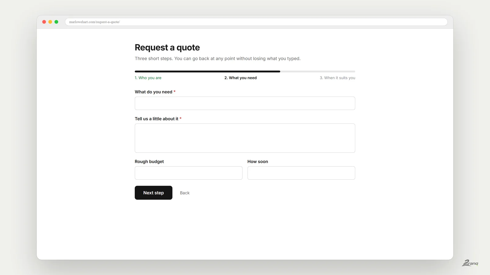
- Good: who you are, what you need, when it suits you.
- Good: your details, your vehicle, upload the documents.
- Bad: fields one to six, fields seven to twelve, fields thirteen to eighteen.
When a step has a subject, the visitor knows what is coming next and the progress bar means something. When it is an arbitrary cut, every step feels like an interruption.
Put the easy step first
Ask for the cheap information first and the expensive information last. Name and email cost nothing to give. A phone number, a budget or a document costs trust, and trust grows over three screens.
There is a practical reason too. If your form stores entries per step, or you send a notification on the first step, you keep a usable lead even when someone abandons on step three. A single screen form gives you nothing at all in that case.
Validate on every step, and again on the server
Two rules that get skipped, and both bite later. Check each step before letting someone move on, otherwise they reach the end and get thrown back to a mistake made three screens ago. And check everything again on the server, because the browser can be lied to. Anything that only runs in JavaScript is a suggestion, not a rule.
What happens if JavaScript does not load?
A multi step form is built with JavaScript, so a broken script normally means a broken form. The safe behaviour is to fall back rather than fail: with scripts off, show every step at once as one long form and let it submit normally. The visitor gets an uglier form instead of no form, and the server applies the same rules either way.
The progress bar is not decoration
It is the reason people finish. It has to answer two questions at a glance: how far along am I, and what is left. A bar with no labels answers the first and not the second.
- Label the steps with their subject, not "Step 2".
- Show the current step clearly, and keep the others readable rather than hidden.
- Let people go back without losing what they typed.
- Do not animate it. Movement on a form reads as a delay.
Are multi step forms free in WordPress?
Mostly not. WPForms lists multi-page forms as part of Pro on their own WordPress.org listing. Ninja Forms sells Multi Step Forms as a paid add-on. Fluent Forms puts Multi-step form in the Pro column, although its conditional logic is free. Gravity Forms has no free tier. That is the wall most people hit at this exact point in a project.
Building one without the upgrade
We ran into this often enough on client work that we wrote 2ranq Forms and published it free under the GPL. Multi step is a normal feature, not a tier.
How it works in practice: you add a page break field where you want the form to split, and the builder does the rest. There is a progress bar with five ready made styles, validation runs on each step and again on the server, and with JavaScript disabled every step renders at once and the form still sends. Seven of the twenty nine included templates already come split into steps, including a job application, a patient intake and a vendor onboarding form.
A three step form that works, as a starting point
If you are not sure how to split yours, this shape fits most enquiry and booking forms and you can adapt it in ten minutes.
- Step one, who you are. Name, email, and nothing else. Two fields, no friction.
- Step two, what you need. The service, a short description, any options. This is the step people came to fill in.
- Step three, the details that cost trust. Phone number, preferred time, budget range, any document.
Measure before and after. If completion does not improve, the problem was not the length, and splitting it further will not help either.
Long form that nobody finishes?
Usually it is not the length, it is where the form is cut. We are happy to look at yours and say where we would split it.